


Tableau: Creating Dual Layered Color Changing KPI Tiles

By: CloudADDIE
Published: June 12, 2019
In one of our recent projects, CloudADDIE consultants had to implement a mobile dashboard with Tableau for a client. Per the client’s requests and requirements, the dashboard was composed of KPI (Key Performance Indicators) tiles that changed color based on the status of the account. If the user desires to view more detailed information, the tiles feature expandable chart details.
This tutorial will walk you through step by step on how to create these color changing KPI tiles. For other Tableau tutorials, visit the tutorials "Tableau: Creating A Navigation Button to Another Dashboard" and "Tableau: Creating Expandable Charts using Action Menu".
What We Hope to Accomplish:
- Using calculated fields to control the color of the title dynamically.
- Using the action button to set links for each tile to the corresponding charts.
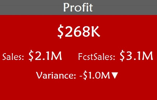
A Sample KPI Tile
This is a sample KPI tile I have created for the sample superstore database that is included in Tableau.
The Functions:
- Large number displays profit.
- The small numbers display a comparison of sales and sales forecast.
- Variance displays the difference between the actual and forecast sales.
- The arrow will point up or down based on variance.
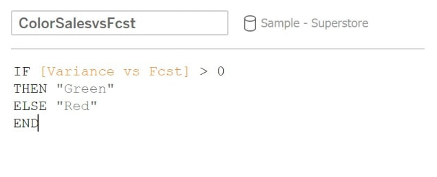
- If actual sales is higher than forecast sales, tile will turn green, if actual sales is lower than forecast sales, tile will turn red.
This tile is broken into two layers. The top layer includes the header portion of the tile. The bottom layer is the body. In order to create the layers, we need to create 2 calculated fields for both of the layers to reside in.
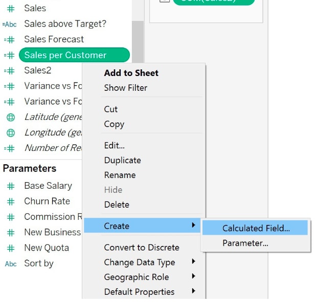
Creating Base Calculations
Step 1. Right click inside the measures panel, Create -> Calculated Field
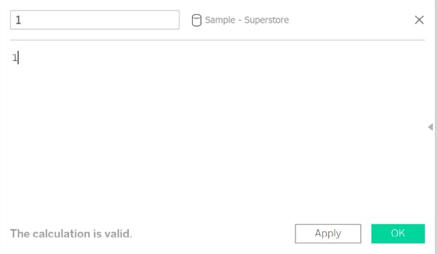
Step 2. I have named the first calculated field "1" and given it a value of 1. (names can be whatever)
Step 3. Create a second calculated field "2" and give it a value of 10.
Step 4. Drag both of the measures into the Rows field.
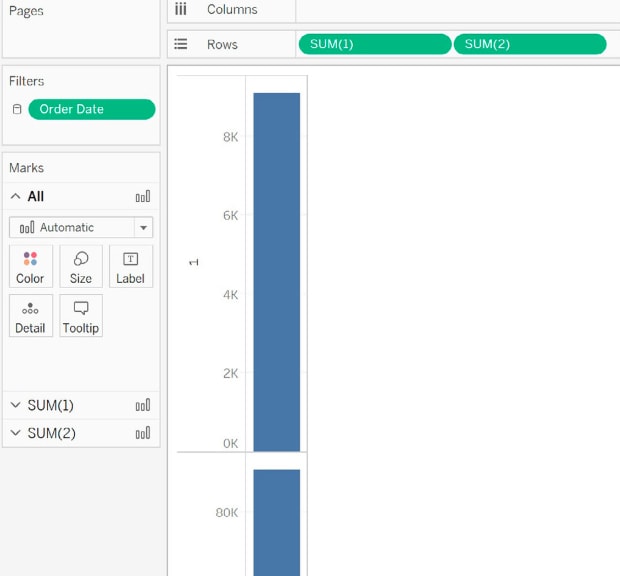
Preparing the Base
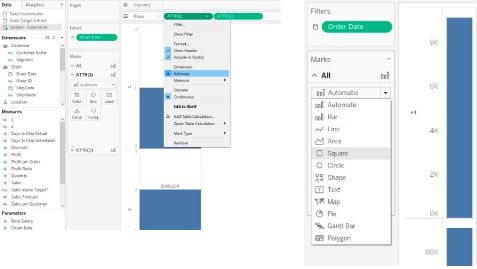
Step 5. Change measures "1" and "2" to an Attribute, by clicking the drop down arrow -> Attribute.
Step 6. In the panel Marks, make sure you have "All" selected, then click the drop down to expand, then select square for the base that we will use.
Step 7. Use the Size panel to adjust the size of the square, then drag the edge of the charts to adjust the width.
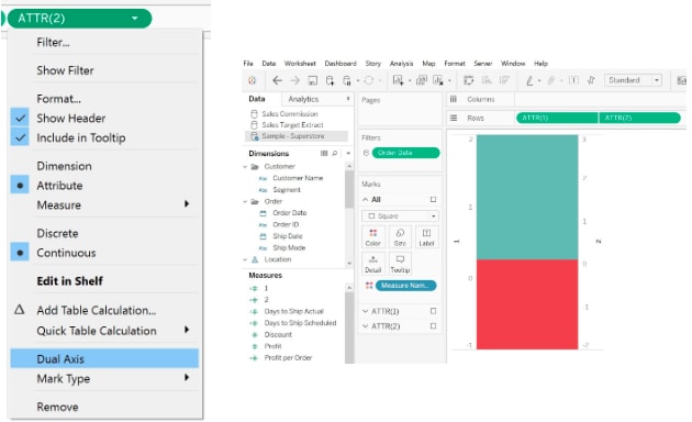
Step 8. Click on the drop down for ATTR "2" and select dual axis, you will notice that both the squares are over lapping now. (Color may change, but it's okay, we will adjust it later)
Formatting the Tile
Step 9. Right click on the axis and make sure Synchronize axis is checked
Step 10. Right click on the axis again then select Edit Axis.
Step 11. For my tile I have set the Range to fixed with a start value of 0 and end value of 16. This will determine the position for top and bottom layer.
Step 12. Then drag the edges around some more until desired position
Step 13. Now we have the base of the tile finished, we can right click the axis again, and uncheck Show Header
Calculating the Metrics
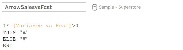
For this example, we will be using 3 controls. These are variance, arrow, and color. Remembering back to our earlier section describing the functions, if the variance is a negative number, then the arrow will be pointed down, and the color of the square will be red (the same logic applies vice versa).
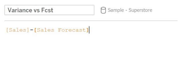
- Variance - difference between Actual and Forecast
- Arrow - to control the arrow up or down, based on variance (Unicode arrows can be copy and pasted by searching online)
- Color - to control the color red or green, based on variance
Formatting the Metrics
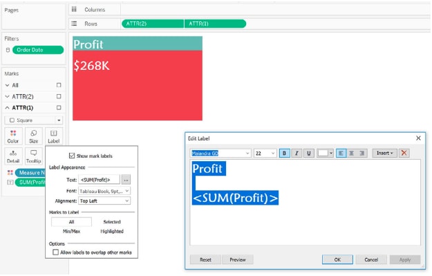
Step 14. Drag and drop the Arrow calculated field, and the Variance calculated field into Label.
Step 15. Click on Label, in the popup, click on the 3 dots next to Text
Step 16. In the Edit Label window, edit the format as desired
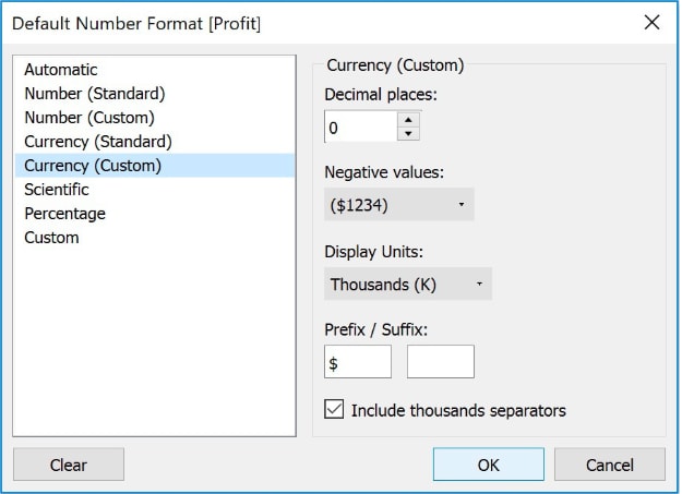
Step 17. For this example, I have changed the Default Number Format to display in Thousands for Profit, and Millions for Sales.
Adding Colors for Easier Visualization
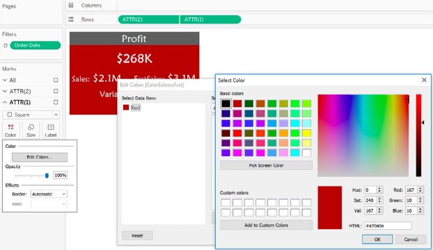
Step 18. Drag and drop the Color calculated field into the base tile. (For this sample, the base tile is ATTR(1))
Step 19. Click on color->Edit Color
Step 20. In the pop up window, you will see "Red," which is the value we have assigned based on variance.
Step 21. Now we have to associate "Red" with the actual color, double clicking the square next to "Red," a color picker window will pop up, select a desired color.
Step 22. Note: use the same way to set color for "Green" (You can flip the > sign in the color calculation to set the color for Green)
Feel free to contact us for more information.
FREE CONSULTATION
Schedule your Free Consultation, to see it in action!
Contact Us!
We offer Autonomous Systems for EPM Cloud Applications such as Oracle Planning & Budgeting Cloud Service (PBCS/EPBCS), Financial Close & Consolidations Cloud Service (FCCS), Enterprise Data Management Cloud Services (EDMCS), Account Reconciliation Cloud Service (ARCS), Profitability & Cost Management (PCM) and more.